Reaction Time Progress Tracking: How to Read Your Trend
March 21, 2026 | By Marcus Adler
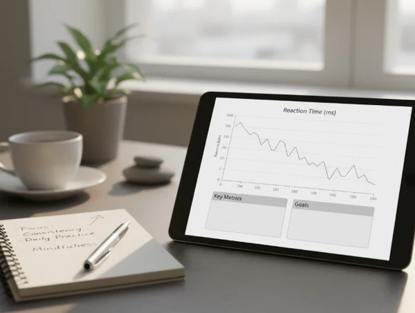
A reaction time chart becomes useful when it shows more than one lucky run. Many users test once, see a fast score, and assume they have found their true level. Others get one slow session and worry that everything is getting worse. Progress tracking helps because it turns single moments into a pattern.
That is one of the most valuable parts of a site like this. A simple score tells you what happened today. A trend helps you understand what usually happens across days, weeks, or repeated practice.
The goal is not to stare at a graph and hunt for perfection. The goal is to use the reaction time test hub as a feedback loop: test, compare, learn, and adjust.
Why one fast run does not tell the whole story
A single fast result can happen on a good day, with fresh focus, low distractions, and smooth device conditions. A single bad result can show up after poor sleep, screen lag, heavy stress, or a slow warm-up. Neither number is meaningless, but neither number should dominate the story.
That is why progress tracking matters more than one standout score. A useful trend shows whether you are becoming more consistent, whether your average is moving, and whether your best scores are backed up by repeat performance.
The same logic works in reverse. If your chart turns noisy, the answer is not always "train harder." Sometimes the better question is what changed around the test conditions.
What reaction time progress tracking should really measure
A strong chart is not just a record board. It is a way to see patterns with enough context to make decisions.
Personal bests, averages, and normal session swings
Personal bests are motivating, but they are not the whole picture. A best score tells you what was possible in one run. An average tells you what is more repeatable. Session-to-session swings tell you how stable your performance really is.
That matters because reaction time is rarely identical from run to run. A useful chart helps you compare all three layers: peak score, typical score, and variability. When those layers move together, the trend is easier to trust.
Why repeated testing gets more useful over time
Repeated testing becomes more meaningful once it covers enough sessions to show a pattern. A PMC study on repeated assessment found a clear practice effect. Simple reaction time improved by almost 7 ms between the first 2 sessions and by almost 13 ms between the first and tenth sessions. That is a useful reminder that some early progress comes from practice effects, not just a sudden jump in underlying ability. See the [PMC study on repeated assessment].
That does not make the improvement fake. It means the trend needs interpretation. Early gains may reflect learning the rhythm of the test, settling into the click timing, or becoming more comfortable with the task. Later gains often become slower and harder to earn.
This is why the performance history chart becomes more useful over time. The longer the record, the easier it is to separate a warm-up effect from a real shift in performance.

Three common trend patterns and what they usually mean
Most users will see one of a few recognizable shapes in their data.
A steady downward trend in milliseconds
A steady drop in milliseconds usually points to cleaner execution, better anticipation control, or more consistent practice conditions. This is the easiest pattern to interpret because it shows movement in one direction instead of random noise.
Even here, caution helps. Improvement is more convincing when the average is moving, not just the single best run. A good trend is not only faster. It is also more repeatable.
A jagged chart with good days and bad days
A jagged chart is common, especially when users test under different conditions. Sleep, fatigue, stress, time of day, caffeine, and device differences can all change a session. A PMC study on sleep deprivation found worse mean reaction time and more lapses on the Psychomotor Vigilance Test under sleep-deprived conditions. That is a useful reminder that a bad day on the chart may reflect state, not lost skill. See the [PMC study on sleep deprivation and vigilance].
This kind of chart is not useless. It is a clue that consistency may matter more than intensity. If your trend keeps jumping, start asking what changed around the test instead of only asking what happened in the score.
A sudden slowdown after a strong streak
A sudden slowdown can feel discouraging, but it does not automatically mean regression. Sometimes it reflects fatigue after a period of frequent testing. Sometimes it follows a change in monitor, browser, mouse, keyboard, or room setup. Sometimes it simply shows that a strong streak was unusually clean.
This is where note-taking becomes powerful. If the chart drops right after a poor night of sleep, a new laptop, or a stressful work week, the slowdown may have a context you can actually use.
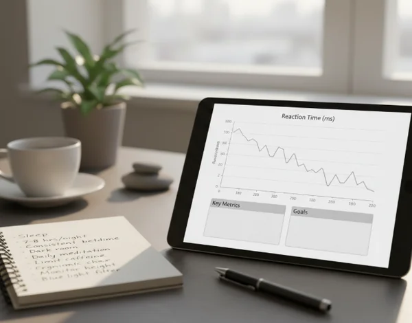
How to make your reaction time history more useful
Progress tracking becomes more valuable when the testing conditions are stable enough to compare.
Keep test conditions stable enough to compare sessions
If you want the chart to mean more, keep as much of the setup constant as possible. Use the same device when you can. Test at a similar time of day. Use the same input method. Give yourself a short warm-up before chasing a best score.
The site itself already warns that display refresh rate and input lag can affect absolute numbers. That means the online reaction tracker works best when you compare like with like. A 190 ms run on one setup and a 205 ms run on another setup may not be a clean comparison.
A simple note system helps. Record whether you changed gear, felt tired, or switched test modes. Those details make the trend easier to trust.
When a trend deserves more than another test run
Most slow sessions are performance questions, not medical ones. Still, the site is a benchmark tool, not a diagnosis tool. If you notice a persistent slowdown alongside other concerning changes in attention, coordination, memory, or daily functioning, another test run may not be the right next step.
NIMH says a primary care provider can perform an initial mental health screening and refer someone to a mental health professional when there are broader concerns. NIMH also says people in emotional distress can call or text 988 for immediate support. See [NIMH help for mental health concerns].
If these changes persist, see a healthcare provider or seek professional help rather than relying on more tests. That does not mean every slower week is a health warning. It means a reaction time chart should stay in its lane. Use it for performance insight, training feedback, and pattern spotting. Use a professional evaluation when the concern is bigger than the score itself.
Next steps after checking your reaction time trend
The best reaction time progress tracking is not about proving that every session must beat the last one. It is about learning what your scores do under repeat conditions and which habits actually support better performance.
Keep the chart, but read it like a coach reads training notes. Look for direction, consistency, and context. Do not let one outlier decide the whole story.
If you want to keep building a cleaner record, the reaction speed homepage can serve as your regular checkpoint. Test under similar conditions, watch the pattern, and let the trend guide your next adjustment.